unzip accounts.zip
gunzip logs.jsonl.gzGetting Started with Kibana
Now that you have Kibana installed, you can step through this tutorial to get fast hands-on experience with key Kibana functionality. By the end of this tutorial, you will have:
-
Loaded a sample data set into your Elasticsearch installation
-
Defined at least one index pattern
-
Used the Discover functionality to explore your data
-
Set up some visualizations to graphically represent your data
-
Assembled visualizations into a Dashboard
The material in this section assumes you have a working Kibana install connected to a working Elasticsearch install.
Video tutorials are also available:
Before You Start: Loading Sample Data
The tutorials in this section rely on the following data sets:
-
The complete works of William Shakespeare, suitably parsed into fields. Download this data set by clicking here: shakespeare.json.
-
A set of fictitious accounts with randomly generated data. Download this data set by clicking here: accounts.zip
-
A set of randomly generated log files. Download this data set by clicking here: logs.jsonl.gz
Two of the data sets are compressed. Use the following commands to extract the files:
The Shakespeare data set is organized in the following schema:
{
    "line_id": INT,
    "play_name": "String",
    "speech_number": INT,
    "line_number": "String",
    "speaker": "String",
    "text_entry": "String",
}
The accounts data set is organized in the following schema:
{
    "account_number": INT,
    "balance": INT,
    "firstname": "String",
    "lastname": "String",
    "age": INT,
    "gender": "M or F",
    "address": "String",
    "employer": "String",
    "email": "String",
    "city": "String",
    "state": "String"
}
The schema for the logs data set has dozens of different fields, but the notable ones used in this tutorial are:
{
    "memory": INT,
    "geo.coordinates": "geo_point"
    "@timestamp": "date"
}
Before we load the Shakespeare and logs data sets, we need to set up {ref}mapping.html[mappings] for the fields. Mapping divides the documents in the index into logical groups and specifies a field’s characteristics, such as the field’s searchability or whether or not it’s tokenized, or broken up into separate words.
Use the following command to set up a mapping for the Shakespeare data set:
curl -XPUT http://localhost:9200/shakespeare -d '
{
 "mappings" : {
  "_default_" : {
   "properties" : {
    "speaker" : {"type": "string", "index" : "not_analyzed" },
    "play_name" : {"type": "string", "index" : "not_analyzed" },
    "line_id" : { "type" : "integer" },
    "speech_number" : { "type" : "integer" }
   }
  }
 }
}
';
This mapping specifies the following qualities for the data set:
-
The speaker field is a string that isn’t analyzed. The string in this field is treated as a single unit, even if there are multiple words in the field.
-
The same applies to the play_name field.
-
The line_id and speech_number fields are integers.
The logs data set requires a mapping to label the latitude/longitude pairs in the logs as geographic locations by
applying the geo_point type to those fields.
Use the following commands to establish geo_point mapping for the logs:
curl -XPUT http://localhost:9200/logstash-2015.05.18 -d '
{
  "mappings": {
    "log": {
      "properties": {
        "geo": {
          "properties": {
            "coordinates": {
              "type": "geo_point"
            }
          }
        }
      }
    }
  }
}
';
curl -XPUT http://localhost:9200/logstash-2015.05.19 -d '
{
"mappings": {
"log": {
"properties": {
"geo": {
"properties": {
"coordinates": {
"type": "geo_point"
}
}
}
}
}
}
}
';curl -XPUT http://localhost:9200/logstash-2015.05.20 -d '
{
"mappings": {
"log": {
"properties": {
"geo": {
"properties": {
"coordinates": {
"type": "geo_point"
}
}
}
}
}
}
}
';The accounts data set doesn’t require any mappings, so at this point we’re ready to use the Elasticsearch
{ref}/docs-bulk.html[bulk] API to load the data sets with the following commands:
curl -XPOST 'localhost:9200/bank/account/_bulk?pretty' --data-binary @accounts.json
curl -XPOST 'localhost:9200/shakespeare/_bulk?pretty' --data-binary @shakespeare.json
curl -XPOST 'localhost:9200/_bulk?pretty' --data-binary @logs.jsonl
These commands may take some time to execute, depending on the computing resources available.
Verify successful loading with the following command:
curl 'localhost:9200/_cat/indices?v'You should see output similar to the following:
health status index               pri rep docs.count docs.deleted store.size pri.store.size
yellow open   bank                  5   1       1000            0    418.2kb        418.2kb
yellow open   shakespeare           5   1     111396            0     17.6mb         17.6mb
yellow open   logstash-2015.05.18   5   1       4631            0     15.6mb         15.6mb
yellow open   logstash-2015.05.19   5   1       4624            0     15.7mb         15.7mb
yellow open   logstash-2015.05.20   5   1       4750            0     16.4mb         16.4mb
Defining Your Index Patterns
Each set of data loaded to Elasticsearch has an index pattern. In the previous section, the
Shakespeare data set has an index named shakespeare, and the accounts data set has an index named bank. An index
pattern is a string with optional wildcards that can match multiple indices. For example, in the common logging use
case, a typical index name contains the date in MM-DD-YYYY format, and an index pattern for May would look something
like logstash-2015.05*.
For this tutorial, any pattern that matches the name of an index we’ve loaded will work. Open a browser and
navigate to localhost:5601. Click the Settings tab, then the Indices tab. Click Add New to define a new index
pattern. Two of the sample data sets, the Shakespeare plays and the financial accounts, don’t contain time-series data.
Make sure the Index contains time-based events box is unchecked when you create index patterns for these data sets.
Specify shakes* as the index pattern for the Shakespeare data set and click Create to define the index pattern, then
define a second index pattern named ba*.
The Logstash data set does contain time-series data, so after clicking Add New to define the index for this data
set, make sure the Index contains time-based events box is checked and select the @timestamp field from the
Time-field name drop-down.
|
Note
|
When you define an index pattern, indices that match that pattern must exist in Elasticsearch. Those indices must contain data. |
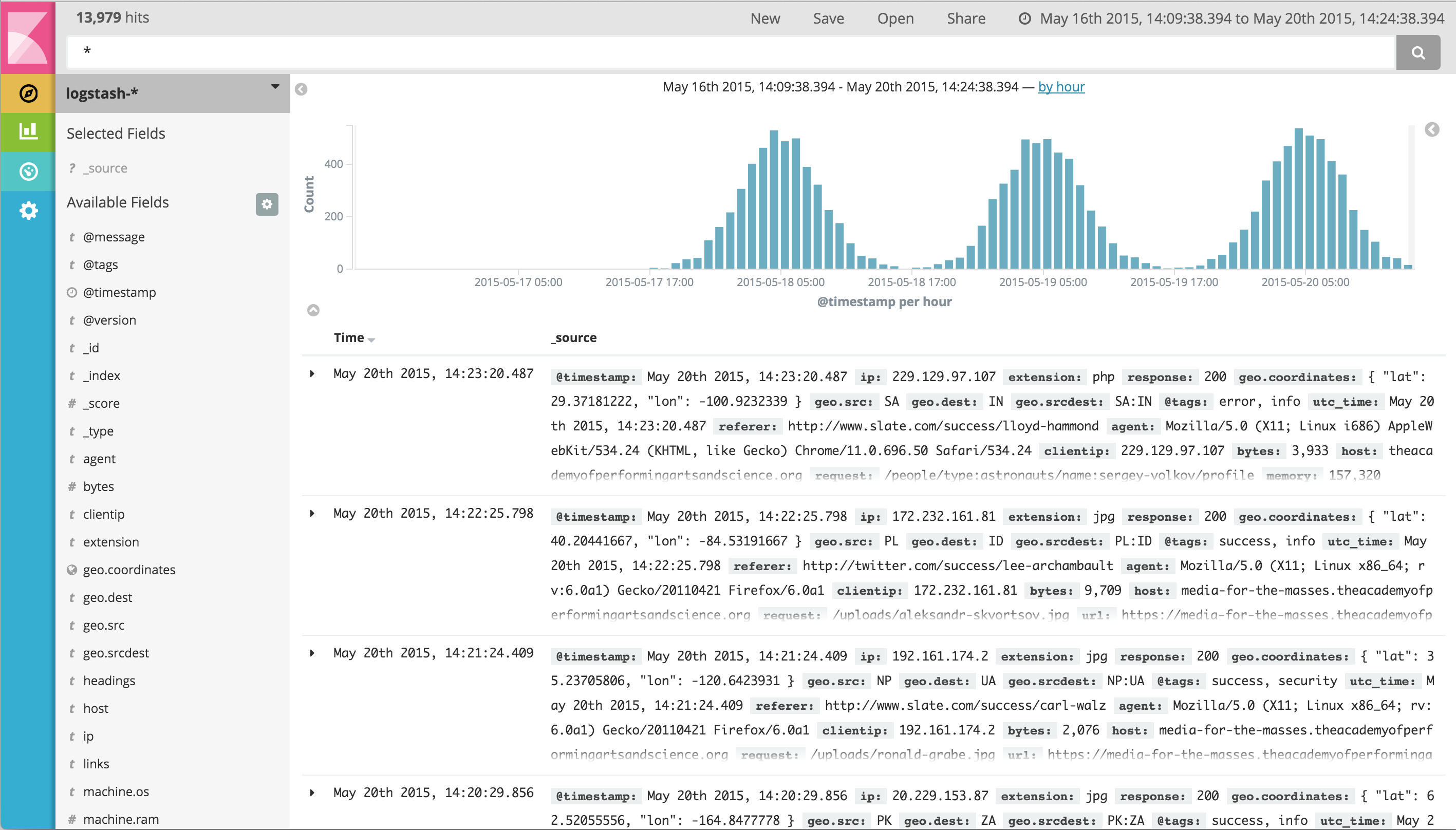
Discovering Your Data
Click the Discover  tab to display Kibana’s data discovery functions:
Right under the tab itself, there is a search box where you can search your data. Searches take a specific {ref}/query-dsl-query-string-query.html#query-string-syntax[query syntax] that enable you to create custom searches, which you can save and load by clicking the buttons to the right of the search box.
Beneath the search box, the current index pattern is displayed in a drop-down. You can change the index pattern by selecting a different pattern from the drop-down selector.
You can construct searches by using the field names and the values you’re interested in. With numeric fields you can use comparison operators such as greater than (>), less than (<), or equals (=). You can link elements with the logical operators AND, OR, and NOT, all in uppercase.
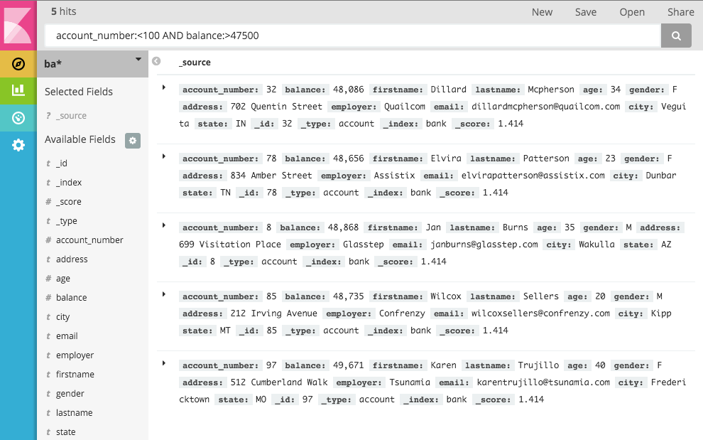
Try selecting the ba* index pattern and putting the following search into the search box:
account_number:<100 AND balance:>47500This search returns all account numbers between zero and 99 with balances in excess of 47,500.
If you’re using the linked sample data set, this search returns 5 results: Account numbers 8, 32, 78, 85, and 97.
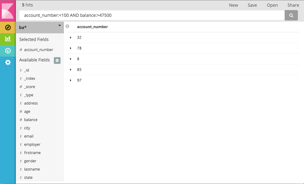
To narrow the display to only the specific fields of interest, highlight each field in the list that displays under the
index pattern and click the Add button. Note how, in this example, adding the account_number field changes the
display from the full text of five records to a simple list of five account numbers:
Data Visualization: Beyond Discovery
The visualization tools available on the Visualize tab enable you to display aspects of your data sets in several different ways.
Click on the Visualize ![]() tab to start:
tab to start:
Click on Pie chart, then From a new search. Select the ba* index pattern.
Visualizations depend on Elasticsearch {ref}/search-aggregations.html[aggregations] in two different types: bucket aggregations and metric aggregations. A bucket aggregation sorts your data according to criteria you specify. For example, in our accounts data set, we can establish a range of account balances, then display what proportions of the total fall into which range of balances.
The whole pie displays, since we haven’t specified any buckets yet.

Select Split Slices from the Select buckets type list, then select Range from the Aggregation drop-down selector. Select the balance field from the Field drop-down, then click on Add Range four times to bring the total number of ranges to six. Enter the following ranges:
0             999
1000         2999
3000         6999
7000        14999
15000       30999
31000       50000
Click the Apply changes button  to display the chart:
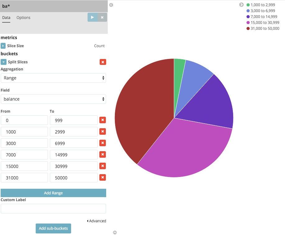
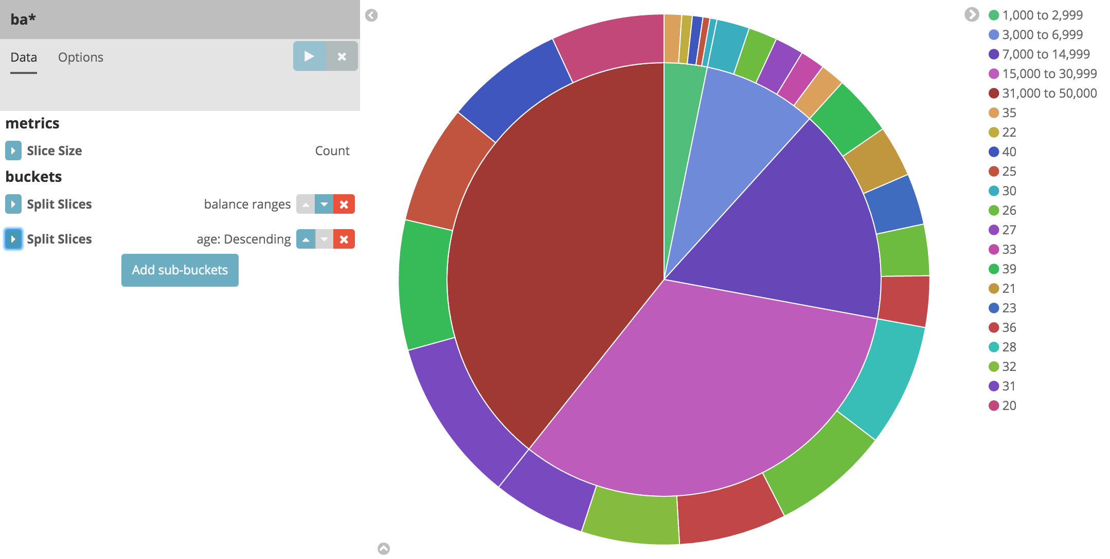
This shows you what proportion of the 1000 accounts fall in these balance ranges. To see another dimension of the data, we’re going to add another bucket aggregation. We can break down each of the balance ranges further by the account holder’s age.
Click Add sub-buckets at the bottom, then select Split Slices. Choose the Terms aggregation and the age field from
the drop-downs.
Click the Apply changes button to add an external ring with the new
results.
Save this chart by clicking the Save Visualization button to the right of the search field. Name the visualization Pie Example.
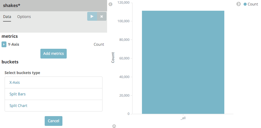
Next, we’re going to make a bar chart. Click on New Visualization, then Vertical bar chart. Select From a new
search and the shakes* index pattern. You’ll see a single big bar, since we haven’t defined any buckets yet:
For the Y-axis metrics aggregation, select Unique Count, with speaker as the field. For Shakespeare plays, it might be useful to know which plays have the lowest number of distinct speaking parts, if your theater company is short on actors. For the X-Axis buckets, select the Terms aggregation with the play_name field. For the Order, select Ascending, leaving the Size at 5. Write a description for the axes in the Custom Label fields.
Leave the other elements at their default values and click the Apply changes button
. Your chart should now look like this:
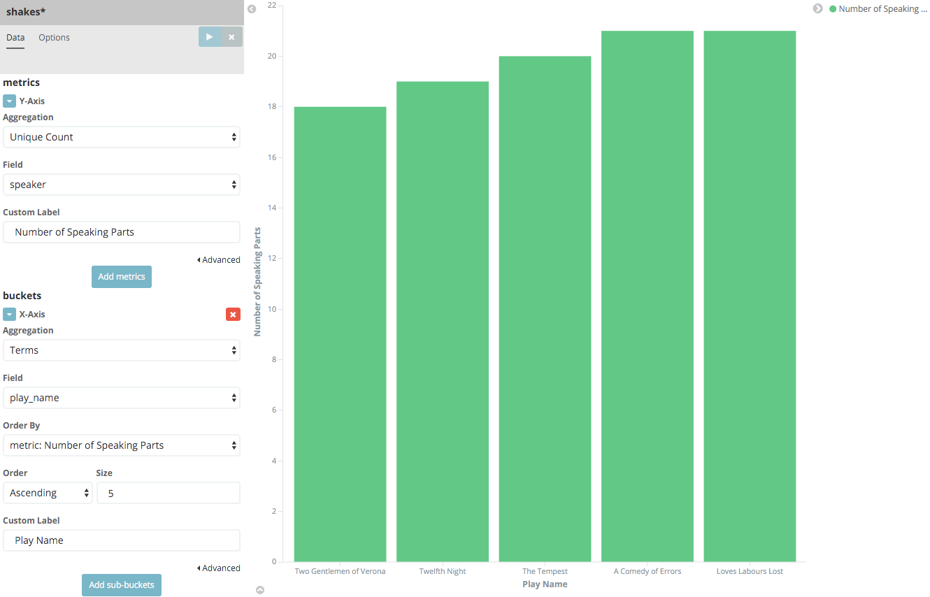
Notice how the individual play names show up as whole phrases, instead of being broken down into individual words. This is the result of the mapping we did at the beginning of the tutorial, when we marked the play_name field as 'not analyzed'.
Hovering on each bar shows you the number of speaking parts for each play as a tooltip. You can turn this behavior off, as well as change many other options for your visualizations, by clicking the Options tab in the top left.
Now that you have a list of the smallest casts for Shakespeare plays, you might also be curious to see which of these
plays makes the greatest demands on an individual actor by showing the maximum number of speeches for a given part. Add
a Y-axis aggregation with the Add metrics button, then choose the Max aggregation for the speech_number field. In
the Options tab, change the Bar Mode drop-down to grouped, then click the Apply changes button
. Your chart should now look like this:
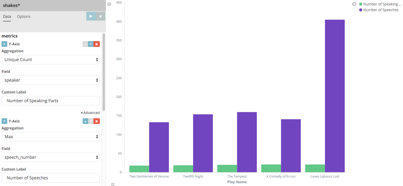
As you can see, Love’s Labours Lost has an unusually high maximum speech number, compared to the other plays, and might therefore make more demands on an actor’s memory.
Note how the Number of speaking parts Y-axis starts at zero, but the bars don’t begin to differentiate until 18. To make the differences stand out, starting the Y-axis at a value closer to the minimum, check the Scale Y-Axis to data bounds box in the Options tab.
Save this chart with the name Bar Example.
Next, we’re going to make a tile map chart to visualize some geographic data. Click on New Visualization, then
Tile map. Select From a new search and the logstash- index pattern. Define the time window for the events
we’re exploring by clicking the time selector at the top right of the Kibana interface. Click on *Absolute, then set
the start time to May 18, 2015 and the end time for the range to May 20, 2015:
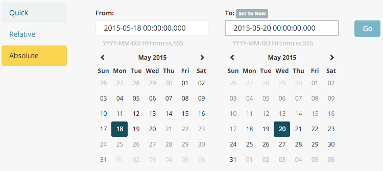
Once you’ve got the time range set up, click the Go button, then close the time picker by clicking the small up arrow at the bottom. You’ll see a map of the world, since we haven’t defined any buckets yet:
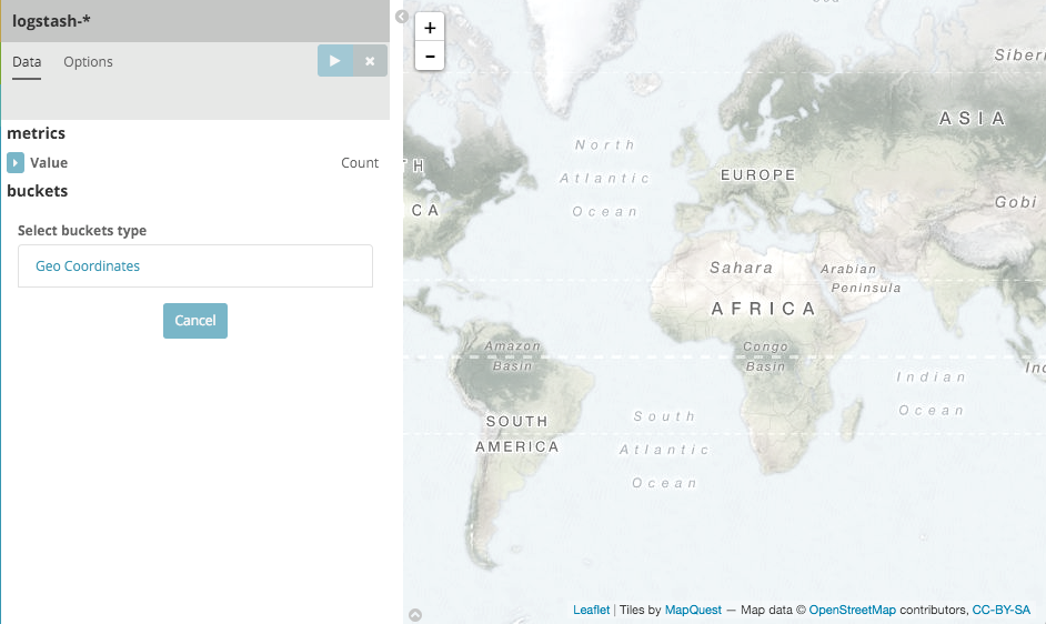
Select Geo Coordinates as the bucket, then click the Apply changes button .
Your chart should now look like this:
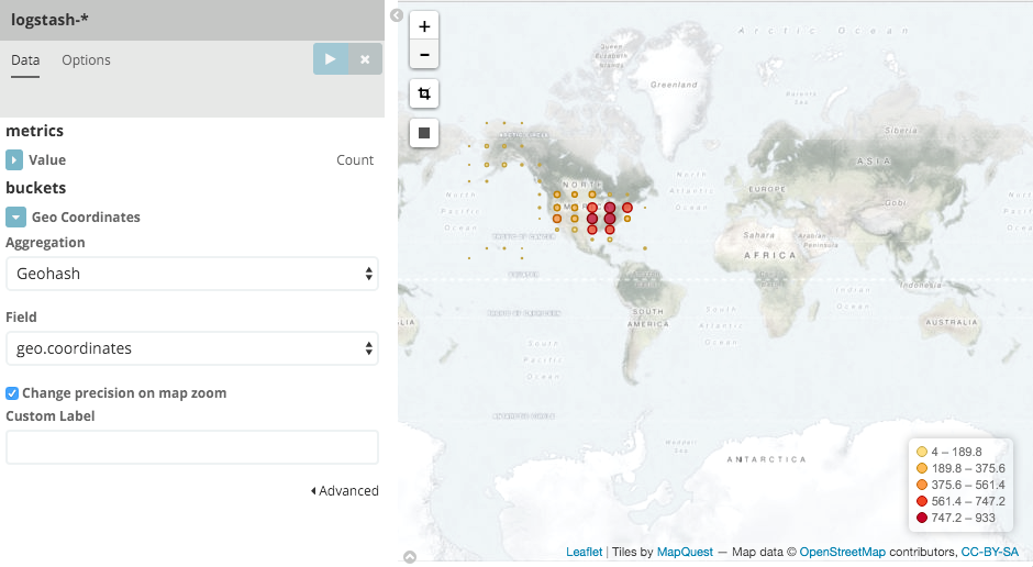
You can navigate the map by clicking and dragging, zoom with the  buttons, or hit the Fit
Data Bounds
buttons, or hit the Fit
Data Bounds  button to zoom to the lowest level that includes all the points. You can
also create a filter to define a rectangle on the map, either to include or exclude, by clicking the
Latitude/Longitude Filter
button to zoom to the lowest level that includes all the points. You can
also create a filter to define a rectangle on the map, either to include or exclude, by clicking the
Latitude/Longitude Filter  button and drawing a bounding box on the map.
A green oval with the filter definition displays right under the query box:
button and drawing a bounding box on the map.
A green oval with the filter definition displays right under the query box:
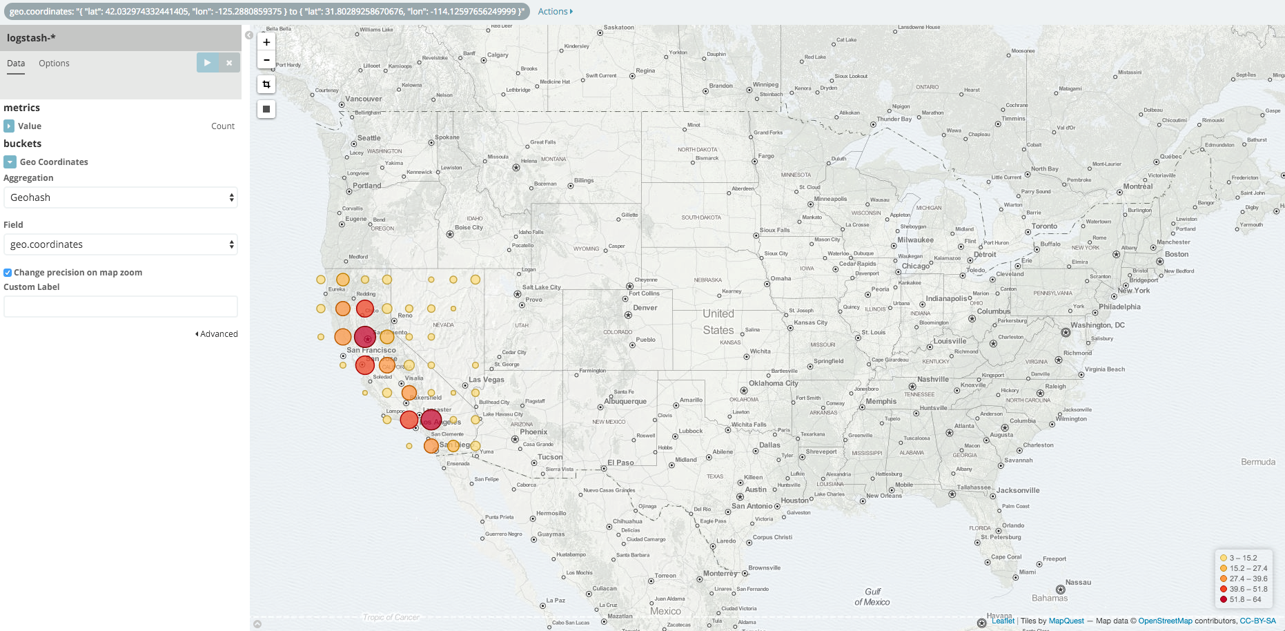
Hover on the filter to display the controls to toggle, pin, invert, or delete the filter. Save this chart with the name Map Example.
Finally, we’re going to define a sample Markdown widget to display on our dashboard. Click on New Visualization, then Markdown widget, to display a very simple Markdown entry field:
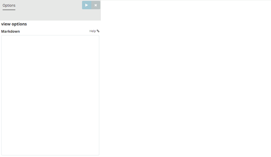
Write the following text in the field:
This is a tutorial dashboard!
The Markdown widget uses markdown syntax. > Blockquotes in Markdown use the > character.
Click the Apply changes button to display the rendered Markdown in the
preview pane:
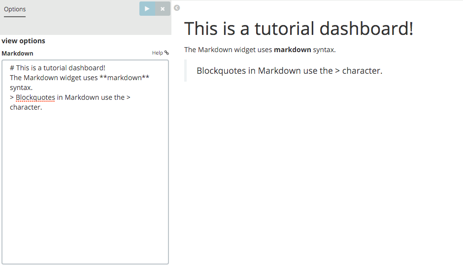
Save this visualization with the name Markdown Example.
Putting it all Together with Dashboards
A Kibana dashboard is a collection of visualizations that you can arrange and share. To get started, click the Dashboard tab, then the Add Visualization button at the far right of the search box to display the list of saved visualizations. Select Markdown Example, Pie Example, Bar Example, and Map Example, then close the list of visualizations by clicking the small up-arrow at the bottom of the list. You can move the containers for each visualization by clicking and dragging the title bar. Resize the containers by dragging the lower right corner of a visualization’s container. Your sample dashboard should end up looking roughly like this:
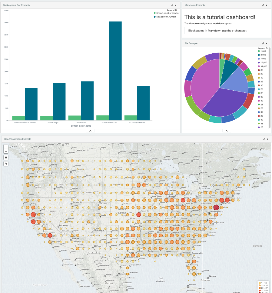
Click the Save Dashboard button, then name the dashboard Tutorial Dashboard. You can share a saved dashboard by clicking the Share button to display HTML embedding code as well as a direct link.
Wrapping Up
Now that you’ve handled the basic aspects of Kibana’s functionality, you’re ready to explore Kibana in further detail. Take a look at the rest of the documentation for more details!